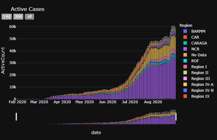
New Active Cases Tracking
The active cases trend chart in this tracker is different from the usual active cases trend charts that are usually based on the date of reporting. The dates used here are based on the date of onset of illness and date of recovery which should give a more accurate picture of the trend of active cases.

Improvements
A vertical line to show the last 15-day period, similar to the DOH tracker, should be added to make it easier to identify the days that do not have at least 90% complete data yet.
Summary Table Changes
The creation of summary table is changed from the plotly table to our own generator function. The new table is a lot moore lightweght looks much better integrated with the Chalk theme.
Last n Days Filter
The filter is replaced by date range buttons and range slider with a default range.
Layout
Removed the embedded classes that ware carryovers from the previous design that was using iframe to show the charts. This improved the user experience in moble screens.